Late into the night, I found myself lamenting on how difficult to read the old JANRICK logo was. Having been over a minute since I’ve updated this website, and even longer since I created the ‘JANRICK’ logo, which has for better or worse, stuck with around for the past 5 years, I thought I’d give it a quick go. After all, in that time I’d delivered brand overhauls for no less than 8 brands and created new logos for many more. I thought it was high time I gave my own name a little makeover.
I mean how long could a simple text-based logo take? (I would then proceed to work till sunrise, creating many unseen tests and iterations). Ah, the inefficiency of every overly-analytical creative. Let me share my process.
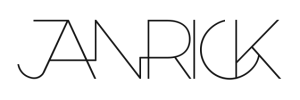
This was what I started with:

Designed in 2015 for a CV, I wanted to use the ‘N’ as a joining pulse to show heartbeat/life at the core of what I do, and to show that different things connect. It was as minimal as logos go, as was popular during the time, but had a heart (literally!).
I started just wanting to make it work better on different backgrounds by simply making it thicker, and also spacing the letters closer together to communicate the idea of connected-ness better.
First draft:

Looked decent, but I thought the thicker font made the visual of a pulse less clear. It made me do a double take on the decision to go thick. I decided to have a second go at the thin version of the logo, and connect more words together, at the expense of losing the ‘pulse’ key visual.
Second draft:

I liked it. I thought the aesthetic was very scandinavian-esque. I then asked myself, what did I want to communicate in a logo, and did this do that? I sat on it for a bit and decided it wasn’t the most effective option. It negated my main spark and instinct to update the logo (thin fonts are less versatile and don’t work well in many visual settings). It muddied the key visual of a pulse, and on second thought it looked a little cluttered.
I then decided to revisit the first draft, and zeroed in on single a clearer goal: to communicate the idea of connected-ness visually, across all letters.
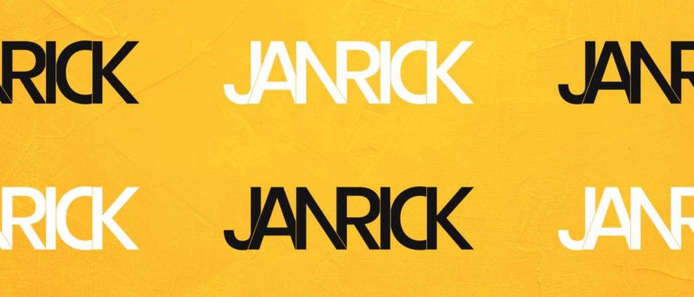
This time, instead of relying on a single visual trope, I decided to try and join every individual letter, and make small breaks to show separation, while playing on the neighboring letter’s shapes. Phew, that was a mouthful. Anyway, I can show you better than I can explain.
Final draft:

Over 7 hours later, I had it. My personal logo for probably the next 5 years.
“7 hours!?” – I hear you think. Yes, this took that long. Frankly not the best way to spend my time, but as probably gleaned in my process, it takes time to find something that works. It’s not as easy as splicing and layering letters automatically beside each other. Clean design takes time (and thought) too! At last count, this final draft had over 60 layers (including throwaway tests and misplaced elements that didn’t work).
Just like most visual overhauls, it starts with an idea, but morphs into something else as you run through the iterative creative process. I thought I’d share a little behind that process for whoever you are reading this, and that you found it insightful.
Takeaways for creatives:
- Always have a clear design goal in mind, with one main objective.
- Trust the spark that triggered an intention behind a project.
- You’re not always going to get it right the first, second or third time, and that’s fine. Sit on it, ask for feedback.

